Understanding COVID19 in Connecticut. It takes a town
Well, it has been way too long since I posted something. As with most of you life during the pandemic has been interesting to say the least. I’ve been working hard (to include trying to find a new job), practicing good hygiene, socially distancing, wearing a mask etc., etc. But so far I have avoided the temptation to post about the virus (or should I say the data surrounding the virus) until now. As you may have divined I have succumbed to the trend as of today. Hopefully with good reason and good effect!
From my news feed today…
Setup and libraries
I won’t apologize but yes there are a lot of libraries invloved and yes I am going to suppress all the various start-up messages.
#######
library(dplyr)
library(tidyr)
library(forcats)
library(purrr)
library(lubridate) # Date wrangling
library(ggplot2)
theme_set(theme_bw())
library(scales) # Pretty axis labels
library(tigris)
options(tigris_use_cache = TRUE)
library(gganimate) # GIF production
library(tidycensus) # Population estimates
library(transformr) # used by gganimate
library(ggthemes) # map themes
library(viridis) # Heatmap color palette
library(zoo) # rollapply
Initial data and wrangling
Nathan got his data from the COVID-19 Data Repository by the Center for Systems Science and Engineering (CSSE) at Johns Hopkins University, which is maintained on Github. Because I may choose to do some further analyses I’m going to grab the data from Connecticut Open Data which has a wealth of information about the state, including a daily set of information about Covid19 which is located at https://data.ct.gov/Health-and-Human-Services/COVID-19-Tests-Cases-and-Deaths-By-Town-/28fr-iqnx. The Connecticut COVID data starts on March 24th which is of course not when this all started but will work for our purposes. To make my life easier I’ve saved the file locally and renamed it to include a date stamp.
As noted by comments in the code the first step is to convert Last.update.date
to a true date format and convert Town into a factor. Once that’s
done it’s easy to plot the obvious charts – raw cumulative cases for the state over
time as well as the same information by Town for all 169 towns.
Applying scales::breaks_pretty to our date axis makes easy work of
how granular we want the axis to be (monthly for now).
##### Get the data here
## https://data.ct.gov/Health-and-Human-Services/COVID-19-Tests-Cases-and-Deaths-By-Town-/28fr-iqnx
## change name to COVID19_CT_By_Town_Oct15.csv

ct_covid <- read.csv("COVID19_CT_By_Town_Oct16.csv")

## Convert to date and factor
ct_covid <-
   ct_covid %>%
   mutate(Last.update.date = lubridate::as_date(Last.update.date,
                                                format = "%m/%d/%y")) %>%
   mutate(Town = factor(Town))

# raw cases over time
ct_covid %>%
   group_by(Last.update.date) %>%
   summarise(cases = sum(Total.cases)) %>%
   ggplot(aes(x = Last.update.date, y = cases, group = 1)) +
   geom_line() +
   scale_x_date(breaks = scales::breaks_pretty(n = 10)) +
   scale_y_continuous(labels = scales::label_number(big.mark = ",")) +
   labs(
      title = "COVID-19 cases in Connecticut",
      x = "Month",
      y = "Cases",
      caption = paste0("Image generated: ",
                       Sys.time(), "\n",
                       "Data source: https://data.ct.gov/Health-and-Human-Services/COVID-19-Tests-Cases-and-Deaths-By-Town-/28fr-iqnx")
   )
# raw cases by town over time
ct_covid %>%
   group_by(Town, Last.update.date) %>%
   ggplot(aes(x = Last.update.date, y = Total.cases, group = Town, color = Town)) +
   geom_line(show.legend = FALSE) +
   scale_x_date(breaks = scales::breaks_pretty(n = 10)) +
   scale_y_continuous(labels = scales::label_number(big.mark = ",")) +
   labs(
      title = "COVID-19 cases in Connecticut by town",
      x = "Month",
      y = "Cases",
      caption = paste0("Image generated: ",
                       Sys.time(), "\n",
                       "Data source: https://data.ct.gov/Health-and-Human-Services/COVID-19-Tests-Cases-and-Deaths-By-Town-/28fr-iqnx")
   )
Onward and upward
That was easy, but pretty uninformative. I guess there’s solace in knowing that our 60,000+ cases are but a fraction of the US 8 million but it doesn’t tell us much about the trend other than seeing the “bend” starting in June and what appears to be an increasing trend starting in September. The by town plot is rendered rather useless by having 169 lines and the fact that towns have very disparate populations. That’s why many many towns are clustered under 500, they don’t have large populations to begin with We need to address both of these issues in our final product.
To address the issue of different population levels by town we’ll grab the 2010
Census data on a by town basis. CT data provides those numbers as well
but by using tidycensus we’ll get information about town by county as
well as the all important GEOID which will enable us to put the data
about population on a map.
tidycensus::get_decennial gets us the raw data we need (I checked
and the population numbers match those the state provides – no surprise).
The second step uses some tidyverse magic to clean and filter the data.
The grepl removes some rows that acknowledge the county boundaries but
have zero population. The census data has Town, County and State in one
column we use tidyr::separate to break them apart. States vary but for
CT the towns are known as “county subdivision” in census parlance
and variables = "P001001" gets us the total population for the town
in 2010 according to the census.
ct_town_pops <-
   tidycensus::get_decennial(geography = "county subdivision",
                             variables = "P001001",
                             state = "Connecticut")
ct_town_pops <-
   ct_town_pops %>%
   filter(!grepl("not defined", NAME)) %>%
   rename(population = value, name_cty_st = NAME) %>%
   select (-variable) %>%
   tidyr::separate(col = name_cty_st,
                   into = c("Town", "County", "State"),
                   sep = ",") %>%
   mutate(Town = gsub(" town$", "\\1", Town),
          County = trimws(County, which = "both")) %>%
   select(-State)

ct_town_pops
## # A tibble: 169 x 4
## GEOID Town County population
## <chr> <chr> <chr> <dbl>
## 1 0900118500 Danbury Fairfield County 80893
## 2 0900104720 Bethel Fairfield County 18584
## 3 0900108070 Bridgeport Fairfield County 144229
## 4 0900108980 Brookfield Fairfield County 16452
## 5 0900118850 Darien Fairfield County 20732
## 6 0900123890 Easton Fairfield County 7490
## 7 0900126620 Fairfield Fairfield County 59404
## 8 0900133620 Greenwich Fairfield County 61171
## 9 0900148620 Monroe Fairfield County 19479
## 10 0900150580 New Canaan Fairfield County 19738
## # … with 159 more rowsrange(ct_town_pops$population)## [1] 854 144229Finally we use good
old range to show the smallest town population is
854 and the largest is
1.4422910^{5}.
Next we use tigris::county_subdivisions to get the geographic information
about the shape of each town so we can map it. The package accesses the
geographic shapefiles the
census bureau provides.
Once again grepl
helps us remove rows we don’t want. A call to base plot confirms
we’re on track. A right_join allows us to marry the town shapes
with the town populations into one object called ct_town_data.
ct_town_shapes <-
   tigris::county_subdivisions(state = "Connecticut",
                               county = NULL,
                               cb = FALSE)

ct_town_shapes <-
   ct_town_shapes %>%
   filter(!grepl("not defined", NAME))
# ct_town_shapes

plot(ct_town_shapes$geometry)
ct_town_data <- right_join(ct_town_pops, ct_town_shapes)Let’s roll
The plot looks good even with no special directives and renders both the shoreline and “the notch” well.
We now have two important objects ct_covid and ct_town_data, we still
need to move from cumulative cases to rolling averages over time while
adjusting for population size by making it per capita. For those of you that
just live for long dplyr pipelines that do major transformations of the data
here we go.
We will
- Group by town (so we do all the math by
Town) - Put yesterdays total case count into
prev_countwith alag - Therefore the increase in cases from day to day is
Total.cases - prev_countwhich we’ll callnew_cases - Use
zoo::rollapplyto compute the mean (average) new cases over the last 7 days all call itroll_cases. - After we
ungroupwe can join the population data to the case count data with aleft_join. - Now that evey row of our tibble has
Total.cases,new_cases, androll_caseswe can create a column for each of those “per capita”
The most common per capita method used in public health is per 100,000 residents
so the math is cases divided by population * 100,000 and voila. A tail
gives you a glimpse of what selected columns look like.
roll_ct_covid <- ct_covid %>%
   arrange(Last.update.date) %>%
   group_by(Town) %>%
   mutate(prev_count = lag(Total.cases, default = 0)) %>%
   mutate(new_cases = Total.cases - prev_count) %>%
   mutate(roll_cases = zoo::rollapply(new_cases,
                                            7,
                                            mean,
                                            fill = 0,
                                            align = "right",
                                            na.rm = TRUE)) %>%
   ungroup() %>%
   left_join(
      ct_town_pops
   ) %>%
   mutate(
      cases_capita = Total.cases / population * 100000, # cases per_capita residents
      new_capita = new_cases / population * 100000, # cases per_capita residents
      roll_capita = roll_cases / population * 100000 # rolling new cases per_capita residents
   )

tail(roll_ct_covid %>%
        select(Last.update.date, Town, population, Total.cases, new_cases, roll_cases, roll_capita))
## # A tibble: 6 x 7
## Last.update.date Town population Total.cases new_cases roll_cases roll_capita
## <date> <chr> <dbl> <int> <dbl> <dbl> <dbl>
## 1 2020-10-15 Wind… 29044 692 5 3.14 10.8
## 2 2020-10-15 Wind… 12498 163 1 1 8.00
## 3 2020-10-15 Wolc… 16680 159 2 1.71 10.3
## 4 2020-10-15 Wood… 8990 155 0 0.286 3.18
## 5 2020-10-15 Wood… 9975 71 2 0.571 5.73
## 6 2020-10-15 Wood… 7964 40 0 0.429 5.38Before we go too much farther let’s see what the trend is when we use the 7 day rolling average for new cases across the entire state.
roll_agg_ct_cases <-
   roll_ct_covid %>%
   group_by(Last.update.date) %>%
   summarize(roll_cases = sum(roll_cases))

roll_agg_ct_cases %>%
   ggplot(aes(Last.update.date, roll_cases)) +
   geom_line() +
   geom_smooth(span = .15) +
   labs(
      title = "7-Day Rolling Average of New COVID-19 Cases in Connecticut",
      y = "Cases",
      caption = paste0("Image generated: ",
                       Sys.time(), "\n",
                       "Data source: https://data.ct.gov/Health-and-Human-Services/COVID-19-Tests-Cases-and-Deaths-By-Town-/28fr-iqnx")
   ) +
   theme_bw() +
   theme(
      title = element_text(size = 10),
      axis.title.x = element_blank()
   )
Ah, now there’s a much more informative plot. The black line shows the actual
data with all its jags and sub peaks. The blue line applies geom_smooth(span = .15)
which gives us a smoothing algorithm. Either line tells the same story. April 20-26
was the high point and by late June we were in much better shape. Summer was pretty
flat but by September we were climbing and in October we’re climbing faster. Unless
you ignore the news completely you probably knew this but the state level picture
can be very useful.
Show me the map
I know, I know I promised you a map by Town. First a little more clean-up.
A rolling average of 7 days requires seven days of data so the first day
we can plot is six days from the first date in our data. The state doesn’t
publish data on the weekends or holidays so lets add some rows that basically
just fill in the weekends and holidays from the day before. The tidyr::complete
and tidyr::fill handle that for us.
There are rare cases where the total.cases go down by say one. Probably
correcting a small error. In the unlikely event things turn negative let’s
just call it zero. We’ll do that with a couple of ifelse.
### first date in dataset +6 is when rolling can go above zero
first_date <-
   ct_covid %>%
   pull(Last.update.date) %>%
   min() + 6


roll_ct_covid <-
   roll_ct_covid %>%
   group_by(Town) %>%
   tidyr::complete(Last.update.date = seq.Date(from = min(Last.update.date),
                                               to = max(Last.update.date),
                                               by="day")) %>%
   tidyr::fill(Town.number,
               Total.cases:roll_capita,
               .direction = "down")


temp <- roll_ct_covid %>%
   filter(Last.update.date >= first_date) %>%
   mutate(roll_capita = ifelse(roll_capita < 0,
                               0,
                               roll_capita)) %>%
   mutate(roll_cases = ifelse(roll_cases < 0,
                              0,
                              roll_cases))
Okay now we need to do two more big things and one small thing. First we
need to join the town “shapes” to the town COVID data before we can make
a map. We’ll take our temp object and our ct_town_shapes and
inner_join them.
Unlike Nathan’s map I want to take the rolling average of new cases
per capita roll_capita and put them in discrete “buckets” instead of a
continuous variable. We’ll make 11 buckets evenly spaced from 0 to
49.99999 by increments of 5 plus a final bucket with everything over
50. We’ll do that with cut then forcats::fct_lump_n and
lastly some gsub magic to make the factor levels pretty.
temp_sf <- inner_join(temp, ct_town_shapes) %>%
   select(GEOID, Town, Last.update.date, roll_cases, County:roll_capita, geometry)

temp_sf$roll_cap_levels <-
   temp_sf$roll_capita %>%
   cut_width(width = 5,
             center = 2.5) %>%
   factor()

temp_sf$roll_cap_levels <-
   forcats::fct_lump_n(temp_sf$roll_cap_levels,
                       n = 10,
                       other_level = "> 50")

temp_sf$roll_cap_levels <-
   temp_sf$roll_cap_levels %>%
   fct_relabel(~ gsub(",[0-9]{1,2}",
                      " to ",
                      .x)) %>%
   fct_relabel(~ gsub("\\[|\\]|\\(",
                      "",
                      .x))
A tiny bit of chicanery will allow us to center Town names on our map.
sf::st_centroid and sf::st_coordinates will get us x and y
coordinates to use to place the names near the geographic center of
the town. Then we can make a pretty
map of population by town labeled and with a nice scale. Because
169 towns is a lot of labels and because town boundaries are irregular
we’ll use ggrepel::geom_text_repel to declutter.
We’ll use viridis to ensure that our colors are viewable for those
with challenges seeing certain colors (colorblindness) and print well
in gray scale. We’ll shade the map so that more heavily populated
areas show darkest and with an oversize scale under the map to show
population numbers.
temp_sf <- temp_sf %>%
   mutate(
      CENTROID = purrr::map(geometry, sf::st_centroid),
      COORDS = map(CENTROID, sf::st_coordinates),
      COORDS_X = map_dbl(COORDS, 1),
      COORDS_Y = map_dbl(COORDS, 2)
   )


temp_sf %>%
   filter(Last.update.date == "2020-03-30") %>%
   ggplot() +
   geom_sf(aes(geometry = geometry, fill = population), size = 0.25) +
   ggrepel::geom_text_repel(
      mapping = aes(
         x = COORDS_X,
         y = COORDS_Y,
         label = Town),
      size = 2,
      min.segment.length = .5,
      point.padding = NA,
      segment.color = "grey50",
      force = .5,
      box.padding = .15,
      fontface = "bold") +
   scale_fill_viridis(alpha = .7,
                      direction = -1,
                      discrete = FALSE,
                      labels = comma,
                      breaks = seq.int(10000, 150000, 40000)) +
   ggthemes::theme_map() +
   theme(legend.position = "bottom",
         legend.justification = "center",
         legend.key.size = unit(3, "lines"),
         legend.text = element_text(size = 6)) +
   labs(
      title = "Connecticut town populations",
      subtitle = "Census 2010 data",
      caption = paste0("Image generated: ", Sys.time())
   )
Put it all together
The final step is to make the animation. This essentially means making
a ggplot object in more or less the usual way. The initial lines
should look quite familiar to the previous plot if you have been
following along. Then comes:
gganimate::transition_time(Last.update.date) + enter_fade() + exit_fade()
which warns gganimate that our frames, our transitions, will be based
on Last.update.date. gganimate does not support parallel processing
unfortunately so it does take quite some time to run if we attempt to process
a lot of dates. We’ll create two animations
one with the full span
of data,
all 200 days (all_data), and another quicker one with just the last month
(last_30_days).
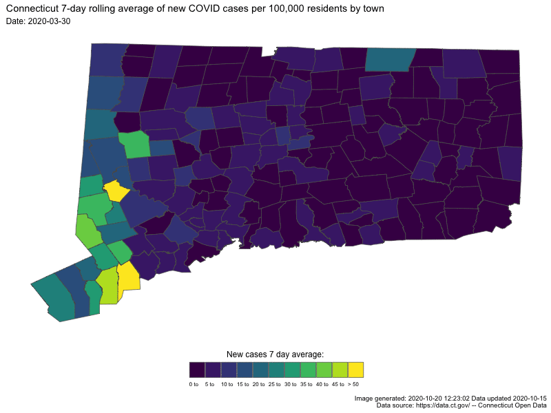
In both cases the darker colors indicates low numbers (good for us) and “hot spots” are readily apparent as bright spots.
days <-
   temp_sf %>%
   pull(Last.update.date) %>%
   n_distinct()
days
## [1] 200days2 <-
temp_sf %>%
filter(Last.update.date >= "2020-09-17") %>%
pull(Last.update.date) %>%
n_distinct()
days2## [1] 29all_data <- ggplot(temp_sf) +
geom_sf(aes(fill = roll_cap_levels, geometry = geometry), size = 0.25) +
viridis::scale_fill_viridis(name = "New cases 7 day average: ",
discrete = TRUE) +
ggthemes::theme_map() +
theme(legend.position = "bottom",
legend.justification = "center",
legend.text = element_text(size = 6)) +
guides(fill = guide_legend(nrow = 1,
title.position = "top",
label.position = "bottom",
label.hjust = 0,
title.hjust = 0.5,
byrow = TRUE)) +
labs(
title = paste0("Connecticut 7-day rolling average of new COVID cases per ",
scales::comma(100000),
" residents by town"),
subtitle = "Date: {frame_time}",
caption = paste0("Image generated: ", Sys.time(),
" Data updated ", max(ct_covid$Last.update.date), "\n",
"Data source: https://data.ct.gov/ -- Connecticut Open Data")
) +
gganimate::transition_time(Last.update.date) +
enter_fade() +
exit_fade()
last_30_days <-
temp_sf %>% filter(Last.update.date >= "2020-09-17") %>%
ggplot() +
geom_sf(aes(fill = roll_cap_levels, geometry = geometry), size = 0.25) +
viridis::scale_fill_viridis(name = "New cases 7 day average: ",
discrete = TRUE) +
ggthemes::theme_map() +
theme(legend.position = "bottom",
legend.justification = "center",
legend.text = element_text(size = 6)) +
guides(fill = guide_legend(nrow = 1,
title.position = "top",
label.position = "bottom",
label.hjust = 0,
title.hjust = 0.5,
byrow = TRUE)) +
labs(
title = paste0("Connecticut 7-day rolling average of new COVID cases per ",
scales::comma(100000),
" residents by town"),
subtitle = "Date: {frame_time}",
caption = paste0("Image generated: ", Sys.time(),
" Data updated ", max(ct_covid$Last.update.date), "\n",
"Data source: https://data.ct.gov/ -- Connecticut Open Data")
) +
gganimate::transition_time(Last.update.date) +
enter_fade() +
exit_fade()Animate it
The call to gganimate::animate is relatively straight-forward, we feed
it the name of the ggplot object we created above all_data or last_30_days
how many frames to create (one per day plus the fade in and fade out) and
optionally information about size and resolution. On my older Mac it takes
approximately 14 minutes for the 200 days, and under 2 minutes for the month.
There is a function to save the animation as a gif which is what I have done for the larger file.
Sys.time()## [1] "2020-10-20 12:23:02 EDT"anim <- gganimate::animate(
all_data,
nframes = days + 20,
fps = 2,
start_pause = 5,
end_pause = 15,
res = 96,
width = 800,
height = 600,
units = "px"
)
gganimate::anim_save("ct_covid_rolling_Oct16.gif", animation = anim)
Sys.time()## [1] "2020-10-20 12:35:47 EDT"# animThe smaller one I’ll include directly in this blog post
Sys.time()## [1] "2020-10-20 12:35:47 EDT"anim2 <- gganimate::animate(
last_30_days,
nframes = days2 + 20,
fps = 1,
start_pause = 5,
end_pause = 15,
res = 96,
width = 800,
height = 600,
units = "px"
)
gganimate::anim_save("last_30_days.gif", animation = anim2)
Sys.time()## [1] "2020-10-20 12:37:00 EDT"anim2
Done
I really enjoyed Nathan’s original post and was happy to be inspired to make a few changes to to hopefully make it more useful . I am always open to comments, corrections and suggestions. Feel free to leave a comment in disqus or send me an email.
Chuck