Plotting Bayes Factors for multiple comparisons using ggsignif
This week my post is relatively short and very focused. What makes it interesting (at least to me) is whether it will be seen as a useful “bridge” between frequentist methods and bayesian methods or as an abomination to both! There’s some reasonably decent code and explanation in this post but before I spend much more time on the functionality I definitely want to hear some feedback.
For the small number of you who have been following along I have been trying to elevate my own use of bayesian methods as well as share what I hope are practical and time saving pieces of code that are relatively simple to use and reuse across different datasets. I’ve been focusing on some of the fastest male runners on record and while not strictly necessary you may benefit from reading some of the earlier postings.
Today the exercise is to follow-up on what I did conceptually last
post
but add plotting, using ggplot2 and ggsignif, the bayes factors associated with
the multiple comparisons that arise from what is traditionally referred to as a
oneway ANOVA. Last post I was able to produce output that was analogous to that
generated by pairwise.t.test with bayes factors as opposed to “p values”. My
thinking is that one of the reasons that bayesian methods are not more broadly
adopted is that the lack of familiarity is both conceptual compared to NHST
but also because the actual output is so strikingly different. My hope is that
being able to print and plot objects that at least feel familiar in form(at)
will help more people engage with Bayesian methods.
Read on! I’ll say it again below but comments and critique are always welcomed
via disqus or email you’ll have no trouble finding the icon links in a couple
of places. Please comment, have I done something useful here or is this a
Frankenstein’s monster, a terrible idea of a hybrid creature?
I’m tired of running!
I’ve been using the same dataset for the last few posts. All about Usain Bolt and 100m sprinters. It’s nice data but I’m tired of it. I recently ran across a post that made use of the data from the 2016 US Census American Community Survey (ACS) Public Use Microdata Sample (PUMS). While that post was about ensemble models there was one table that caught my eye because it summarized results that surprised me. The chart was about income in 2016 by sector of employment, and the means were not in an order I would have imagined.
Let’s grab the data set from the WinVector Github site and begin our quest for a plotting solution. We’ll load the packages we need (suppressing the load messages), set my favorite ggplot theme, and grab the data.
It’s a funny thing to say but I love R’s factor methods. More than a little
geeky and also perhaps a bit antiquated since in many places across the web
you’ll find stern admonitions to never ever use factors just stick to character
type. I embrace factors and as a consequence really appreciate the forcats
package that is part of the tidyverse. After we throw away the gp column
about “test” versus “training” that we don’t need let’s use forcats package to
do a little cleanup and reordering. I’ve put comments in the code but I want to
especially highlight forcats::fct_reorder which allows us to trivially relevel
our employment factor by mean income.
library(tidyverse)
library(BayesFactor)
library(ggsignif)
theme_set(theme_bw()) # set theme

location <- "https://github.com/WinVector/PDSwR2/raw/master/PUMS/incomedata.rds"
incomedata <- readRDS(url(location))

# remove the test vs training column as unnecessary.
incomedata$gp <- NULL

# just cleaning uo the factor so it will make shorter better labels on the plot
incomedata$employment <- fct_recode(incomedata$employment,
  "Self Not Inc" = "Self employed not incorporated",
  "Self Incorporated" = "Self employed incorporated",
  "Private for Profit" = "Employee of a private for profit",
  "Private Non Profit" = "Private not-for-profit employee",
  "Federal Government" = "Federal government employee",
  "State Government" = "State government employee",
  "Local Government" = "Local government employee"
)

# In case I want to reduce down to 3 more fundamental
# categories Private, Government, or self employed
incomedata$empcategory <- fct_collapse(incomedata$employment,
  "Self" = c("Self Not Inc", "Self Incorporated"),
  "Private" = c("Private for Profit", "Private Non Profit"),
  "Government" = c("Federal Government", "State Government", "Local Government")
)

incomedata$employment <- forcats::fct_reorder(
  .f = incomedata$employment,
  .x = incomedata$income,
  .fun = mean
)

str(incomedata)
## 'data.frame': 22241 obs. of 6 variables:
## $ income : num 22000 21000 25800 25000 20200 36000 20000 30000 23000 5000 ...
## $ age : num 24 31 26 27 27 47 24 41 43 21 ...
## $ sex : Factor w/ 2 levels "Male","Female": 1 2 2 2 2 1 1 1 2 2 ...
## $ employment : Factor w/ 7 levels "Self Not Inc",..: 2 4 2 2 4 2 2 2 2 2 ...
## $ education : Factor w/ 9 levels "no high school diploma",..: 1 4 4 6 4 2 1 1 6 2 ...
## $ empcategory: Factor w/ 3 levels "Private","Government",..: 1 1 1 1 1 1 1 1 1 1 ...Okay we have the data we need. What I want to do is something like this example taken straight from the helpfile for geom_signif only with the bayes factors displayed instead of p values.
ggplot(mpg, aes(class, hwy)) +
 geom_boxplot() +
 geom_signif(comparisons = list(c("compact", "pickup"),
                                c("subcompact", "suv")
                                )
             )
We pass a list of paired comparisons we want to make and by default it applies
the wilcox.test() function to the dataframe called mpg that we passed it.
Add a boxplot geom and voila we have a nice display. ggsignif is a very nice
package designed to spare us the tedium of doing the math of figuring out where
to put our comparisons on our plot. We could write our own custom geom or even
just try using existing geoms after we calculate everything out, but I’m too
lazy for that. I’d much rather fool ggsignif into doing what we want.
Why even bother?
Before we plunge into writing code let’s review why we might want to do this at all. As I mentioned in previous posts “NHST” has been around a long time and is unlikely to go away in many disciplines any time soon. If I had to pick one and only one reason why I think replacing p values with Bayes Factors on this plot is important and the “right thing to do” (because make no mistake Bayes Factors are not miracles and not without their own challenges) it would be expressed in paragraph 2.5 in this excerpt from Wagenmakers, Lee, Lodewyckx, and Iverson, 2008. I would like our plot to provide an assessment of how our data influences our thinking about the probability of both evidence for our hypothesis (BF10) and evidence against H0 that hypothesis BF01 .
or to be even briefer…
“… frequentist inference does not allow probability statements …”
which is a shame because very often that’s exactly what we want…
“What are the odds of that happening?”
On with the show!
What I want to accomplish:
Be able to show all the possible pairwise comparisons in
ggplotApply the
ttestBFtest from theBayesFactorpackage to the data piped intoggplotDisplay the BF10 and/or BF01 information in a variety of formats, e.g. text or numeric and with various levels of precision.
Not modify or replicate a single line of code from
ggsignif, i.e. use it as is.
The first parameter I need to pass to geom_signif is a list of comparisons
where each element of the list is itself a character vector with two elements.
As the example above shows we retain the ability to pass just certain
comparisons that we choose e.g.,comparisons = list(c("compact", "pickup"), c("subcompact", "suv"))
but we also want a function that can take the 7 levels of class or
employment and just make all 21 pairs for us.
Here’s a function called comparisons_list that will take in our dataframe of
interest with x being the grouping or x axis variable and return what we
need.
comparisons_list <- function(data,
                             x) {

  # creating a dataframe with just the columns of interest
  # make sure the grouping variable x is indeed a factor
  # has no unused levels
  data <-
    dplyr::select(
      .data = data,
      x = !!rlang::enquo(x)
      ) %>%
    dplyr::mutate(.data = .,
                  x = droplevels(as.factor(x)))

  grouplevels <- levels(data$x)
  g1_list <- combn(grouplevels, 2)[1, ]
  g2_list <- combn(grouplevels, 2)[2, ]

  comparisons_list <- lapply(
    1:length(g1_list),
    function(i) c(
      combn(grouplevels, 2)[2, i],
      combn(grouplevels, 2)[1, i]
    )
  )

  return(comparisons_list)
}


head(comparisons_list(data = incomedata,
                      x = employment)
     )
## [[1]]
## [1] "Private for Profit" "Self Not Inc"
##
## [[2]]
## [1] "State Government" "Self Not Inc"
##
## [[3]]
## [1] "Private Non Profit" "Self Not Inc"
##
## [[4]]
## [1] "Local Government" "Self Not Inc"
##
## [[5]]
## [1] "Federal Government" "Self Not Inc"
##
## [[6]]
## [1] "Self Incorporated" "Self Not Inc"length(comparisons_list(data = incomedata,
x = employment)
)## [1] 21comp.list <- comparisons_list(incomedata, employment)Looks like it’s working let’s try it. For now we’ll just run the default
wilcox.test. We’ll use step_increase so we don’t have to think about
spacing.
ggplot(data = incomedata,
       aes(
         x = employment,
         y = income,
         fill = employment,
         group = employment
       )) +
  geom_boxplot(show.legend = FALSE) +
  geom_signif(
    comparisons = comp.list,
    step_increase = .1
  )
Okay that part works. Now we need to work on writing a “test” that ggsignif
understands. That took me awhile to sort through but in the end requires very
little code. Two things to remember both hidden in plain site in the
geom_signif documentation.
“
test= the name of the statistical test that is applied to the values of the 2 columns (e.g. ‘t.test’, ‘wilcox.test’ etc.).” The key here is values which is why I bolded it. What gets passed to the test is not a reference to the columns in the data frame or a formula to be processed. The actual values for in our case income for two certain levels of theemploymentfactor are passed as two distinct vectors.“If you implement a custom test make sure that it returns a list that has an entry called ‘p.value’.” Whatever we do internal make sure that p.value can be found on the output.
Our test, called pairwise_bf, accepts two numeric vectors as input applies
ttestBF to them uses extractBF to create a dataframe (dataframes are after
all just very special cases of lists) with the results. The only other thing we
have to do is copy the bayes factor in the column bf into a column called
p.value to “fool” geom_signif. If that loses you please go back to earlier
posts where I describe extracting the BF in more detail.
The code below shows a test of “Private for Profit” and “Self Not Inc” which generates a BF10 of 3,694,058,115 which shows up on the plot in the right place in scientific notation as 3.7e+09. It’s the very first or bottom paired comparison.
pairwise_bf <- function(x = NULL,
                        y = NULL) {
  results <- ttestBF(x = x,
                     y = y) %>%
    extractBF() %>%
    mutate(p.value = bf)
  return(results)
}

# make two vectors to test function
x1 <- incomedata %>%
  filter(employment == "Private for Profit") %>%
  droplevels() %>%
  pull(income)
y1 <- incomedata %>%
  filter(employment == "Self Not Inc") %>%
  droplevels() %>%
  pull(income)

# try our function
pairwise_bf(x1, y1)
## bf error time code p.value
## 1 3694058115 2.391095e-17 Wed Oct 21 09:34:23 2020 14aa63453ca74 3694058115ggplot(data = incomedata,
aes(
x = employment,
y = income,
fill = employment,
group = employment
)) +
geom_boxplot(show.legend = FALSE) +
geom_signif(
comparisons = comp.list,
test = "pairwise_bf",
step_increase = .1
)
Objectives 1 & 2 above are complete without violating #4. It’s time for…
Customization
Plotting is working but definitely can use some improvement. I’m not talking about color scheme or spacing (although they are important) how about just being able to easily read and interpret those numbers! So I’d like to make at least the following available:
For the purists who simply want the BF10 values we’ll at least enable rounding to a select number of digits via a
kparameter.One of the benefits of a bayesian approach is that we can quantify support for both our research hypothesis (usually labelled BF10) AND quantify support for the converse or null hypothesis (usually labelled BF01). Our custom
pairwise_bfcurrently returns BF10. BF10 can take on any value between greater than zero and less than infinity. Some of the pairs are very large 2.1e+32 and some quite small .047. For me personally it becomes confusing. If we remember that BF01 = 1 / BF10 we can write a case statement so we display BF10 or BF01 depending on which is larger. That way we know immediately which way the support trends.As noted earlier BF values can be very large we’ll give the user the ability to display the natural log value
log()so that for example log(2.1e+32) = 74.4246603 rounded to whatever precision they like.At some point talking about odds over 100:1 (in my humble opinion) loses the need for precision. After all is there really much difference between odds of 1,000:1 versus 1,001:1? We’ll give the user an option to display BF10/BF01 values that are between 1 and 100 as is and then create ranges between 100 to 1,000, 1,000 to one million and greater than one million.
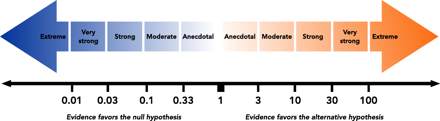
Finally, one of the strengths of using bayes factors is that the user can draw their own conclusion about the strength of the evidence. There are, however, some suggested rubrics for defining the evidence that are gaining in popularity. While not a replacement there have been some attempts to quantify the standards of evidence that would be considered meaningful in a scientific context. One that is widely used is from Wagenmakers, Wetzels, Borsboom, and Van Der Maas (2011). The article summarizes it in Table 1 but you may prefer the large graphic at https://media.springernature.com/full/springer-static/image/art%3A10.1186%2Fs12888-018-1761-4/MediaObjects/12888_2018_1761_Fig1_HTML.png**).
So we’ll add to the function by including a parameter for the display_type as
well as the rounding k. Remember that the object returned from pairwise_bf
is a dataframe with just one row and a column that contains our BF10 that
is named bf. We need to provide geom_signif with a column named p.value so
we can add more columns with variations of how to display bf and then before
we return choose which column to copy into p.value.
The first mutate statement implements #5 above and we’ll call it "support".
The second mutate implements #3 a conversion to a logged and rounded value,
we’ll call it "logged". The final mutate statement implements #4 above, and
in a twist of irony we’ll call it "human" because I find it most human
readable.
At this point our dataframe results looks something like this:
'data.frame':   1 obs. of  7 variables:
 $ bf     : num 5.16
 $ error  : num 8.1e-09
 $ time   : Factor w/ 1 level "Thu Jul 18 09:12:05 2019": 1
 $ code   : Factor w/ 1 level "15f524885ef9": 1
 $ support: chr "moderate BF10"
 $ logged : chr "log(BF10) =  1.64"
 $ human  : chr "BF01 =  5.16 : 1"
The final set of if logic simply determines which one of the display formats
is used based upon the user’s choice from display_type.
pairwise_bf <- function(x = NULL,
                        y = NULL,
                        display_type = "bf",
                        k = 2) {
  results <- ttestBF(x = x, y = y) %>%
    extractBF() %>%
    mutate(support = case_when(
      bf < .01 ~ "extreme BF01",
      bf < .03 & bf >= .01 ~ "very strong BF01",
      bf < .1 & bf >= .03 ~ "strong BF01",
      bf < 1 / 3 & bf >= .1 ~ "moderate BF01",
      bf < 1 & bf >= 1 / 3 ~ "anecdotal BF01",
      bf >= 1 & bf < 3 ~ "anecdotal BF10",
      bf >= 3 & bf < 10 ~ "moderate BF10",
      bf >= 10 & bf < 30 ~ "strong BF10",
      bf >= 30 & bf < 100 ~ "very strong BF10",
      bf >= 100 ~ "extreme BF10"
    )) %>%
    mutate(logged = case_when(
      bf < 1 ~ paste("log(BF01) = ", round(log(1 / bf), k)),
      bf >= 1 ~ paste("log(BF10) = ", round(log(bf), k))
    )) %>%
    mutate(human = case_when(
      bf < .000001 ~ "BF01 >= 1,000,000 : 1",
      bf < .001 & bf >= .000001 ~ "BF01 >= 1,000 : 1",
      bf < .01 & bf >= .001 ~ "BF01 >= 100 : 1",
      bf < 1 & bf >= .01 ~ paste("BF01 = ", round(1 / bf, k), ": 1"),
      bf >= 1 & bf < 100 ~ paste("BF01 = ", round(bf, k), ": 1"),
      bf >= 100 & bf < 1000 ~ "BF10 >= 100 : 1",
      bf >= 1000 & bf < 1000000 ~ "BF10 >= 1,000 : 1",
      bf >= 1000000 ~ "BF10 >= 1,000,000 : 1"
    ))


  if (display_type == "support") {
    results <- mutate(results, p.value = support)
  } else if (display_type == "log") {
    results <- mutate(results, p.value = logged)
  } else if (display_type == "human") {
    results <- mutate(results, p.value = human)
  } else {
    results <- mutate(results, p.value = bf)
  }
  return(results)
}

# pairwise_bf(incomedata$employment, incomedata$income)
To make use of our new “features” we use the test.args parameter when we
invoke geom_signif. Something like test.args = list(c(display_type = "human"), c(k = 1)) will work. For clarity sake let’s limit ourselves to just a
few comparisons (instead of all) by manually inputting our pairs to
comparisons. Since we’re getting close to our solution I’ll also take the time
to do what I should have done all along and add title information and load the
scales package so the y axis can be properly formatted.
geom_boxplot automatically displays the median and outliers, which makes it
clear that as usual with income data we have a long upper tail, so I decided to
add the mean as a plotted point in a different shape and color.
Enough with the formatting though let’s see the results.
library(scales)
ggplot(data = incomedata,
       aes(
         x = employment,
         y = income,
         fill = employment,
         group = employment
       )) +
  geom_boxplot(show.legend = FALSE) +
  stat_summary(fun.y = "mean",
               geom = "point",
               color = "dark red",
               shape = 15,
               size = 3,
               show.legend = FALSE) +
  geom_signif(
    comparisons = list(
      c("Self Not Inc", "Private for Profit"),
      c("Self Not Inc", "State Government"),
      c("Self Not Inc", "Private Non Profit"),
      c("Private for Profit", "State Government"),
      c("Private for Profit", "Private Non Profit"),
      c("Private for Profit", "Local Government")
    ),
    test = "pairwise_bf",
    test.args = list(
      c(display_type = "human"),
      c(k = 1)
    ),
    step_increase = .1
  ) +
  ggtitle(label = "ACS 2016 Income by Employer Type",
          subtitle = "With selected multiple comparisons non directional hypothesis using bayes factors") +
  scale_y_continuous(label = dollar)
## Warning: `fun.y` is deprecated. Use `fun` instead.
Looks good! For me it’s also very illuminating. Until I saw the data I had no idea there was such a large disparity between those who were self-employed and those self-employed who had taken the time and effort to incorporate. The odds as expressed by the BF10 for our data are greater than a million to one that the self employed unincorporated make the same amount as any of the other categories.
I also deliberately selected these 6 pairings so I could reinforce (hopefully not belabor) the utility of BF01. I will confess before I saw the results I labored under the impression that people employed in the private sector would be better paid than government workers. Let’s consider the BF01 values for the “Private for Profit” pairings. Notice that unlike traditional NHST rejection of the null we get actual information value from the Bayes Factors. A BF01 = 13.8 : 1 doesn’t just say we have insufficient evidence to reject the null h0 it actually provides odds of 13.8:1 that the averages are the same. Whereas BF01 = 1.5 : 1 expresses a great deal more uncertainty about whether they are the same or different. Our data don’t provide strong evidence in either direction.
Perhaps using our “support” option across all the pairings is a good thing to
try at this juncture. Just to vary it a little we’ll also shift from box plots
to violin plots. Since we have a lot of pairwise comparisons we’ll also
change some parameters in our call to geom_signif with
step_increase = .07, textsize = 3.0, tip_length = 0.01 to allow us to make
better use of plot real estate.
ggplot(incomedata, aes(
  x = employment,
  y = income,
  fill = employment,
  group = employment
)) +
  geom_violin(show.legend = FALSE) +
  stat_summary(fun.y="mean",
               geom="point",
               show.legend = FALSE) +
  stat_summary(fun.y="median",
               geom="point",
               color = "red",
               shape = 13,
               show.legend = FALSE) +
  geom_signif(
    comparisons = comp.list,
    test = "pairwise_bf",
    test.args = list(
      c(display_type = "support"),
      c(k = 0)
    ),
    step_increase = .07,
    textsize = 3.0,
    tip_length = 0.01
  ) +
  ggtitle(label = "ACS 2016 Income by Employer Type",
          subtitle = "With selected multiple comparisons non directional hypothesis using bayes factors") +
  scale_y_continuous(label = dollar,
                     breaks = seq(from = 0,
                                  to = 250000,
                                  by = 50000)
                     )
## Warning: `fun.y` is deprecated. Use `fun` instead.
## Warning: `fun.y` is deprecated. Use `fun` instead.
Finally, just for completeness, I thought I’d show the results of using
display_type = "log" with 3 digits. While I’m at it I’ll highlight one of
the joys of the open source ecosystem around modular frameworks like ggplot2.
Rather than indulge in additional tweaking of the theme (I know only a little
about them). Besides being able to pick and choose from a wide assortment of
*“geom_" as I did with geom_signif you can also avail yourself of a wide
variety of”ready made" themes. In this case hrbrthemes::theme_ipsum() from
Bob Rudis.
I think the end result looks very nice.
theme_set(hrbrthemes::theme_ipsum())
ggplot(incomedata, aes(
  x = employment,
  y = income,
  fill = employment,
  group = employment
)) +
  geom_violin(show.legend = FALSE) +
  stat_summary(fun.y="mean",
               geom="point",
               show.legend = FALSE) +
  stat_summary(fun.y="median",
               geom="point",
               color = "red",
               shape = 13,
               show.legend = FALSE) +
  geom_signif(
    comparisons = comp.list,
    test = "pairwise_bf",
    test.args = list(
      c(display_type = "log"),
      c(k = 3)
    ),
    step_increase = .09,
    textsize = 3.0,
    tip_length = 0.01
  ) +
  ggtitle(label = "ACS 2016 Income by Employer Type",
          subtitle = "With selected multiple comparisons non directional hypothesis using bayes factors") +
  scale_y_continuous(label = dollar,
                     breaks = seq(from = 0,
                                  to = 250000,
                                  by = 50000)
                     )
## Warning: `fun.y` is deprecated. Use `fun` instead.
## Warning: `fun.y` is deprecated. Use `fun` instead.
Acknowledgements
There’s a quote attributed to Sir Isaac Newton that applies here:
If I have seen further than others, it is by standing upon the shoulders of giants.
While I hope the post and the code in it are useful, I’d be remiss if I didn’t acknowledge how much they rely on the work of others.
Danielle Navarro and her book Learning Statistics With R, which awakened me to using Bayes Factors.
Richard D. Morey and his most excellent
BayesFactorpackage which truly does all the hard work of calculating and makes it look easy.Constantin Ahlmann-Eltze and the
ggsignifpackage which figures prominently in this postIndrajeet Patil and his
ggstatsplotpackage which gives me frequent inspiration on displaying data.
Done
I’m really very interested in feedback on whether people find this functionality useful. I’m tempted to, and would be happy to, expand it further (for example automatic choosing of which comparisons are displayed based upon a criteria the user sets). But as I acknowledged at the outset I’m not sure whether this is a Frankenstein’s monster that will be abhorrent to frequentists and bayesians alike or even whether someone has already implemented this with better code.
I do personally think it is a nice bridge that might be especially useful for those like me who were taught frequentist methods early on and are still learning their way around new methods. On the one hand the display is somehow familiar and comforting while at the same time more informative and less mistake prone.
Chuck

This work is licensed under a Creative Commons Attribution-ShareAlike 4.0 International License